Poshmark
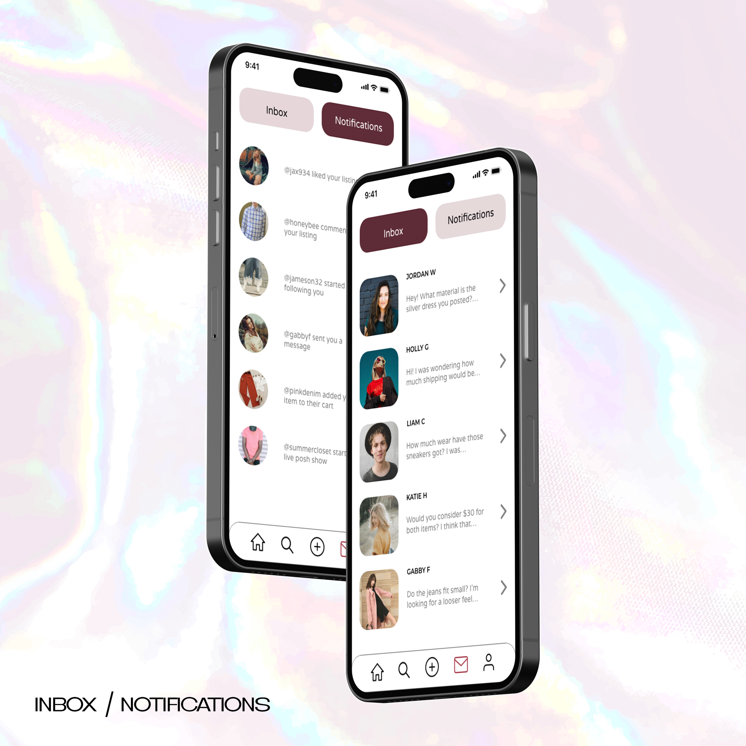
Poshmark app redesign. Problem areas with the app were identified (outlined below) and a general overhaul was done to bring the aesthetics up to date and streamline overall use.


Problem Areas
Too visually busy/overwhelming to look at
Too many options so main functions are harder to access
Looks out of date, has functions that are not intuitive (should be designed more like a social media app)
Main pages that need an overall redesign: feed, shop, product, profile
Lacks direct messaging option
XD Design / Prototype
Sitemap
Process Work
UI Demo


