Dave’s Gourmet
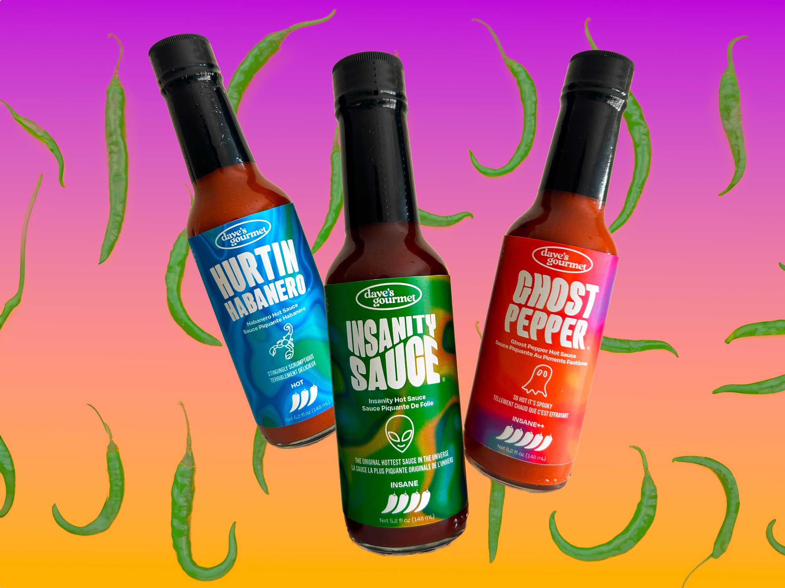
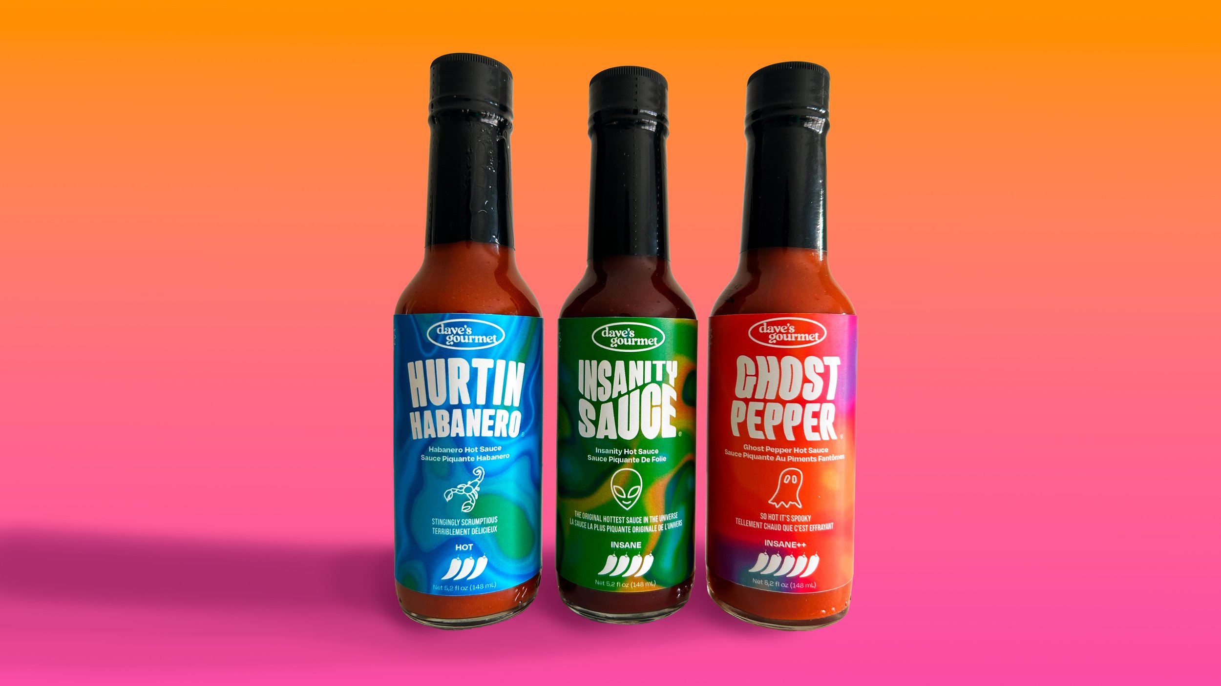
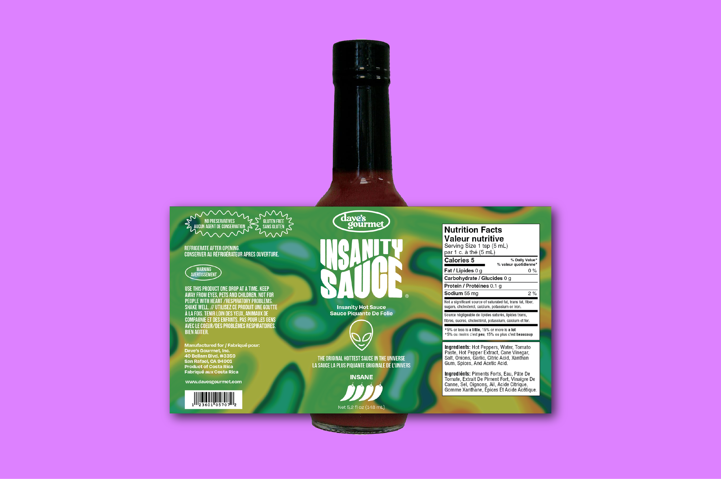
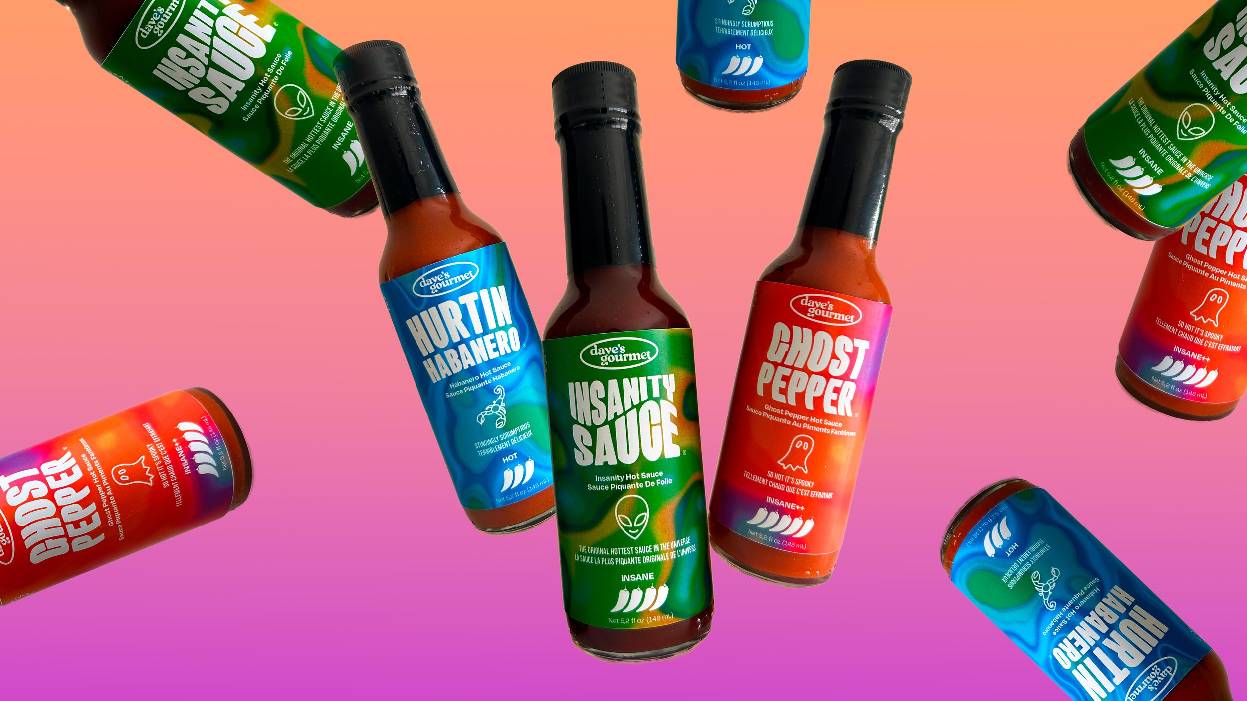
Packaging redesign for three of Dave’s Gourmet hot sauces. The thermal heat map concept conveys the spice level of the products and appeals to the millennial target market while standing out on the shelves. The colours flow from a cool blue up to flaming hot orange based on the pepper scale of each flavour. The typography and icons further contribute to this fun, fresh take on hot sauce packaging.


